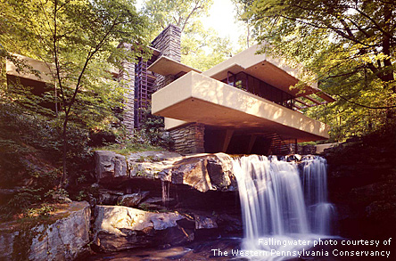
- FALLINGWATER - KAUFMANN RESIDENCE (1935) S.230
- KAUFMANN GUESTHOUSE (1938) S.231
- EDGAR J. KAUFMANN, SR. OFFICE (1937) S.233
(Note, due to the fact that the internet is constantly changing, and items that
are posted change, I have copied the text, but give all the credits available.)
Posted by: Dee Schlotter
http://voiceofcolor.com/en/exchange/the_voice/dee_schlotter.asp
March 1, 2006
Frank Lloyd Wright's Approach to Color by Dee Schlotter"Color was very important to conveying Frank Lloyd Wright's aesthetic of organic architecture as a unified whole. He drew from two sources in determining his palette for a given project: the nature of the site and the nature of the building materials. In the early projects, particularly the Prairie houses that were constructed of brick and stucco, autumnal colors predominate: warm shades of red, gold, brown and yellow-green. These restful yet intense colors were accented by a palette of related hues and created a harmonious, unified and serene environment for the client. At Fallingwater, Wright employed both a limited palette of color and a limited number of materials in his desire to create an organic and integrated whole." Lynda Waggoner, Vice President & Director of Fallingwater.
“Fallingwater, located in the Allegheny Mountains in Southwestern Pennsylvania, is famous because the house in its setting embodies a powerful ideal - that people today can learn to live in harmony with nature. As technology uses more and more natural resources, as the world's population grows even larger, harmony with nature is necessary for the very existence of mankind.” Edgar Kaufmann, Jr. 1978
"In Fallingwater, Wright captured the perfect essence of our desire to live with nature, to dwell in a forested place and be at home in the natural world," Kaufmann continued.
Wright read the works of Whitman, Emerson and Thoreau, sharing their romance with nature and bringing it into his designs.
A reverence for nature permeated Wright's work from the beginning. The sun, trees, stones and water were elements of the natural world that Wright studied and ultimately incorporated into his style of organic architecture.
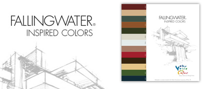
The Voice of Color Collection: Fallingwater Inspired Colors
Inspired by Frank Lloyd Wright, authenticated by the Western Pennsylvania Conservancy, and drawn exclusively from Pittsburgh Paints Voice of Color Collection.
Cherokee Red (Pittsburgh Paints Color #6432-7) - Often referred to as Frank Lloyd Wright's personal favorite, Cherokee Red is perhaps the most famous color at Fallingwater, and was used to coat most of the home's metal and ironwork. Wright is said to have limited his use of Cherokee Red at Fallingwater to metal accents because steel and iron are products of iron ore created through fire.
Covered Wagon #319-5 - This light ochre represents the color on the concrete walls inside and outside of Fallingwater. Wright chose this color because it is reminiscent of the "sere" or dying leaves of the rhododendron, which are in great abundance at the Fallingwater site.
Lava Gray #554-6 - This lava gray trim coat is featured on the screens covering the windows at Fallingwater.
Lion’s Mane #216-5 - Evident throughout Fallingwater, in the kitchen - on the cabinets and countertops - and accent pillows on the cantilevered couches in the living room. This golden hue was chosen to accentuate the natural colors invading the home from the surrounding wilderness.
Grapevine #512-7 - Chosen to replicate the moss-covered tree trunks resulting from Fallingwater's majestic setting above Bear Run.
Moth Gray #515-4, Bone White #516-3, Tanglewood #525-5. Many of Fallingwater's interior walls, floors and structural elements are built from rocks quarried near its isolated Western Pennsylvania site. These three colors represent the multi-colored stone seen throughout the home and property.
Red Gumball #233-7 - This bright, red color is drawn from another fabric at Fallingwater, specifically the additional accent pillows on the cantilevered couches.
Chocolate Truffle #523-7 - In the winter, Fallingwater's fallen rhododendron leaves mellow to create the rich, chocolate-brown ground cover recalled by this color.
Dusty Trail #414-4 - This color was selected because it closely matches the fabric on the cantilevered couches in the living room. Plain, unpatterned furniture coverings were purposely chosen to complement window views of Fallingwater's natural setting.
Mountain Forest #308-7 - Representative of the live rhododendron leaf that is seen extensively at Fallingwater. During the spring and summer, the vast bank of windows in Fallingwater's main living room allows this rich green color to infiltrate the living space.
Blue Lava #550-7 - This warm, blue shade is reminiscent of the famous, fast-rushing creek that continually crashes and flows
[flw/_Private/Navbar Be-mail.htm]